I’ve been a vivid supporter of responsive web design approach for some time, so whenever there is an opportunity to implement it, I am all for it. About two weeks ago, I was approached at work if I could build a landing page for our new fun app, PhotoBlast. I didn’t even see the creative and had said yes as I knew I could take on something small that I will sure enjoy working on. Even though “responsiveness” wasn’t necessarily part of the scope, I made sure to make time for it, regardless the amount of time I got allocated. 🙂
Once I got to see the creative, it was quite obvious that this one might be somewhat challenging to achieve in about 20 hours all the little details but I was ready to take it on anyway.

I first had to really take it all apart to see how I could split up and mark up the content in a way that would make sense but could also accommodate all the creative directions that this one page had. Once I’ve completed with marking up the content in HTML5, that’s when I turned to my CSS file. While still keeping with “content first” concept, I went into structuring my CSS using 320 and Up approach.
This is when the real fun has begun when I got to start with the smallest screen and making decisions what will people get to see and at what dimensions or screen sizes. What truly saved my life and lot of my time was this fabulous tool called ResponsivePx that was created by no other than the talented man, Remy Sharp. He told me about it few months back when we first met during his visit to Portland; however, I wasn’t truly able to test it out until now. Oh man, and does that work like a charm!
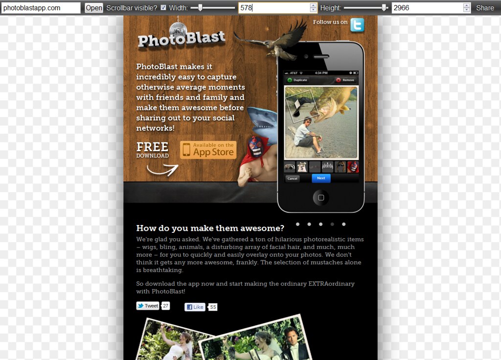
For this project, since there were so many image elements on the page, I wanted to fit them as soon as I had the real estate for it and this was where this tool came super handy when trying to figure the “break points” for different screen sizes. I found it better to use in Chrome, as you got to have a slider to modify width and height of your screen rather than use dropdowns, which you’d have in Firefox.
Well, I am sure you get the point. It’s fun and super easy to use and maybe you’ll get to try it on your next project yourself. There are definitely many aspects that need to be considered when us developers and designers are being responsively responsible but thankfully there are so many resources out there for you to dive in and get inspired.
I find myself referring back to any of A Book Apart books that I keep religiously expanding as new ones are coming out, and I think you should too. In addition, I have attended several conferences or workshops that touch on the subject but this topic is still quite hot, so there are more upcoming ones. If you find yourself in Vancouver BC area in March or you were looking for an excuse to go there, then maybe Simon Collison‘s full day workshop on Crafting Responsive Experiences might convince you, just like 3-day Breaking Development Conference in Orlando, FL one month later – your choice.
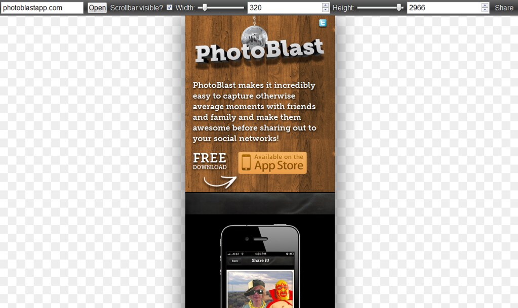
Anyway, that’s that. So now, if you are an iPhone owner, go and download PhotoBlast from App Store and go have fun with it. Or just play with the landing page I built while dragging around the corner of your browser to see how it adapts. 🙂
Update: Thanks to Joel Shapiro, I found a video that Remy did demoing responsivepx.
Nice work, Petra! I didn’t know about ResponsivePx, btw. What a great little idea!
Thank you! Remy sure is a brilliant man when it comes to building very useful tools to make our lives more bearable 😉
Nice work Petra! Thanks for talking about the resource as well.
Thanks Susan, glad you found it useful. I sure can’t wait to take on the next challenge and have as much fun, if not more, with it. 🙂
I totally agree that the mobile first approach as the way to go. Starting with Mobile Boilerplate – HTML5 Boilerplate has been my new standard. I haven’t even been charging for the extra hours of freelance, since I get to learn an new skill that can’t be commoditized. Add some css transition all to it and your really in business with the scaling!
@ Wesley: I feel ‘ya! I’m the same way. I’m just too much of a believer of this approach, so I don’t want the extra time I might need to spend on some projects that are more complex than others to scare away a client. Plus I’m sure more experience we get under our belts, better and faster we will become at this.
And yes, HTML5 Boilerplate is something I find myself going back to quite a bit, especially when it comes to looking for style resets for specific browsers. 😉
[…] Photoblast App (ISITE Design’s Petra Gregorova on building the app’s marking site with responsive design) […]